Earth and Moon
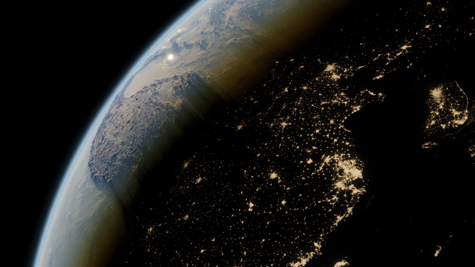
The Artemis launch
A few weeks before NASA's Artemis-I launch in 2022, this began as a quick-turnaround social post to mark the return to lunar flight. The composition is a drone move pulling out from Intrepid Studios — where the work was happening at the time — up through satellite imagery of the Bay Area, out to Earth, and resolving on the Moon through shadow-play.
Quick turnaround is the constraint that shaped everything else. There was no time to invent a planet, so the whole approach became: find the best real data and let it do the work.
What Blue Marble actually gives you
NASA's Blue Marble collection is the reference set, and it is worth understanding what is in it, because "a photo of Earth" is not one image — it is several distinct layers that each solve a different problem.
Topology is the elevation data — the height of the land. Bathymetry is the same thing for the sea floor. Together they let you displace a sphere into something with real relief, so mountain ranges catch light at the correct angle instead of being painted on.
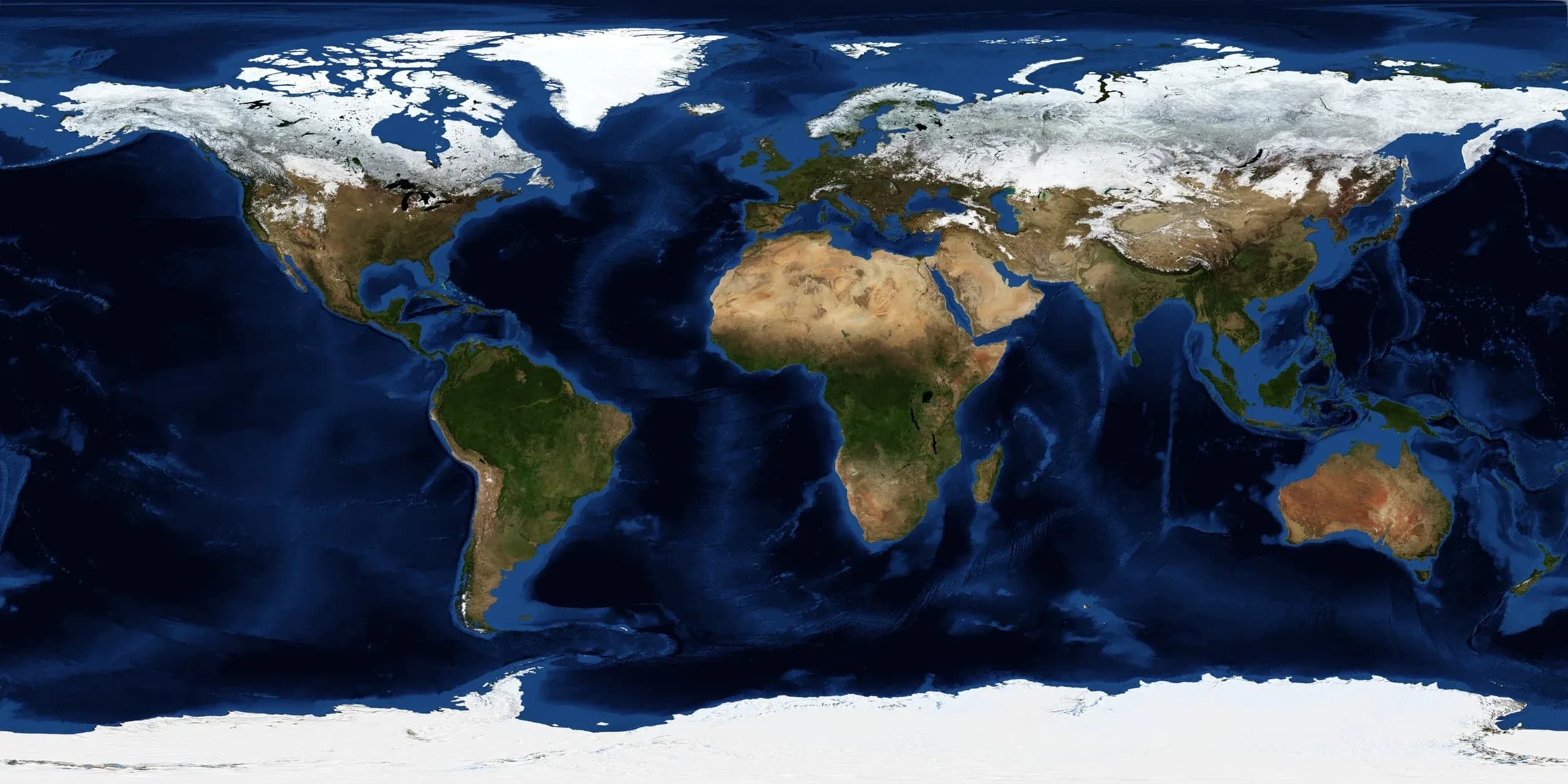
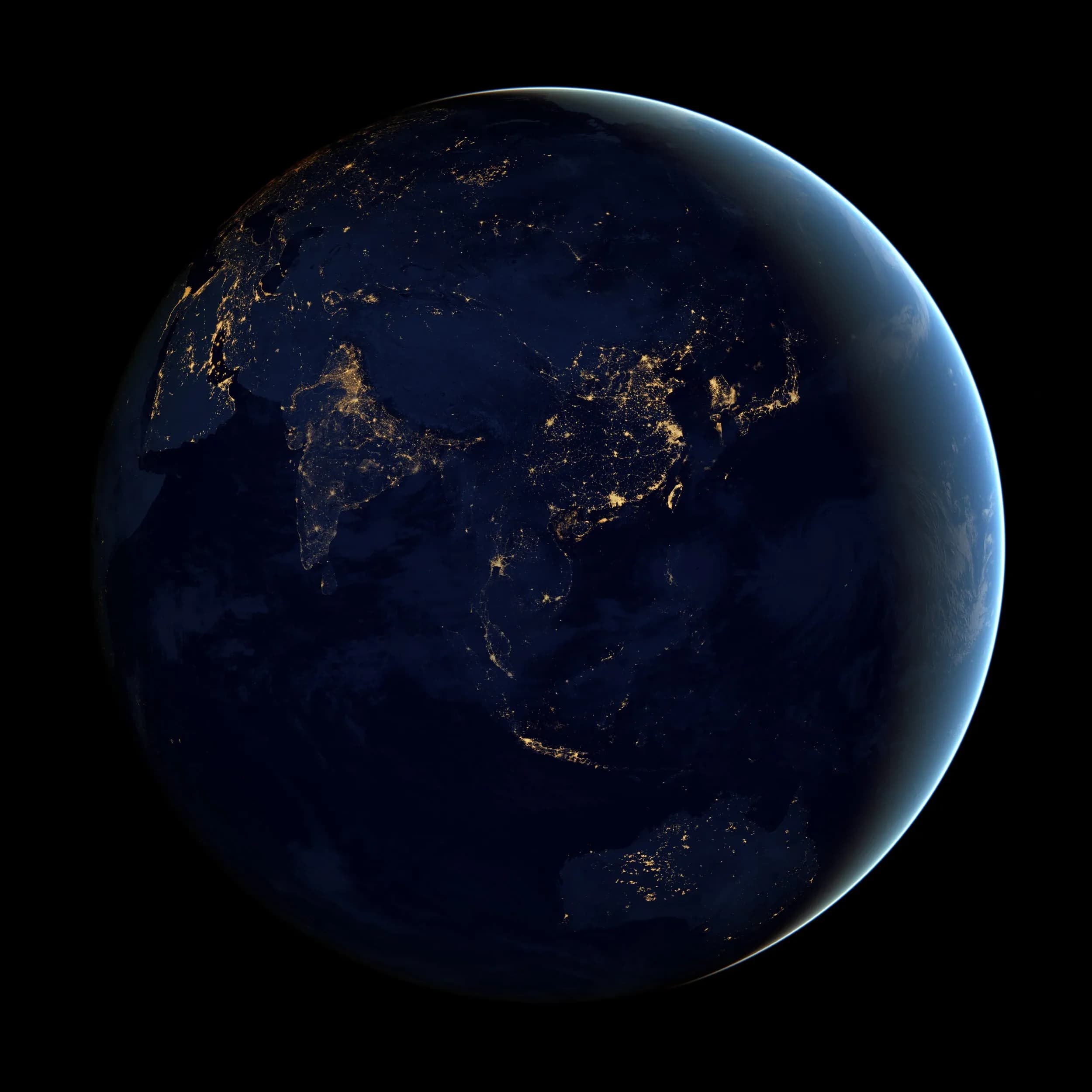
The night lights pass is separate again, and it is the layer that sells inhabitation. It is not decoration: it is an emission map, so the lit side of the planet and the dark side are driven by two different shading paths at once.
The Moon was built the same way, from NASA's height-map scans. Lunar surface detail is almost entirely a displacement problem — there is no atmosphere softening it and no colour variation to hide behind, so if the height data is wrong the terminator gives it away immediately.
Why the atmosphere is the hard part
The atmosphere is where most CG planets fail, and the reason is that an atmosphere is not a surface.
A shell of transparent geometry around the sphere gets you a rim, but it will not produce the thing your eye is actually looking for: the hue shift through sunset. That shift happens because light entering the atmosphere at a shallow angle travels through far more air than light entering head-on, and the longer the path, the more the short wavelengths scatter out. Blue leaves first. What survives to the camera at a grazing angle is red.
So it has to be modelled as volume, not as a shell, and the shading has to be a function of path length through that volume. Get that right and the terminator — the line between day and night — produces the gradient by itself, without anyone painting one. Get it wrong and you have a blue outline that looks like a sticker.
That was the functional light-tracing solution the Blue Marble references made possible: not the textures, but having accurate enough ground truth to check the falloff against.

Reference this good is rare. Most of the work turned out to be deciding what to leave out.